Difference between revisions of "Text"
Views
Actions
Namespaces
Variants
Tools
| Line 1: | Line 1: | ||
== Mystery Font == | == Mystery Font == | ||
In the station, we have a variety of text- signs for depos, etc. | In the station, we have a variety of text- signs for depos, etc. | ||
| − | + | Lets call the language 'Sumerian' - not the ancient cuneiform glyphs but a modern language for a utopian current civilization. | |
| − | With two exceptions we will not use English / Roman characters for this | + | With two exceptions we will '''not''' use English / Roman characters for this |
Most of the text is not important to read; reading it will distract from the visuals, we mainly need it as a visual element, not a literal one. Thus we can make up fonts! | Most of the text is not important to read; reading it will distract from the visuals, we mainly need it as a visual element, not a literal one. Thus we can make up fonts! | ||
| Line 16: | Line 16: | ||
File:Vectorletters.png|vector letters | File:Vectorletters.png|vector letters | ||
</gallery> | </gallery> | ||
| + | |||
| + | However, choice of the general shapes of the letters is complicated by usage, I think we can identify 3 general types of lettering: | ||
| + | #signage and print : this should probably be a truetype font that is believable as type (or more than one for simple vs ornate) | ||
| + | #stencil-ish type signage: this should be similar to e.g. [http://www.dafont.com/boston-traffic.font] | ||
| + | #graphiti: we should probably hand draw this in paint programs as needed (not a font file) | ||
| + | #handwritten: could be handdrawn but we could have a 'handwriting' style font. Comic sans Sumerian anybody ? | ||
== English/Roman == | == English/Roman == | ||
Revision as of 17:30, 25 January 2016
Mystery Font
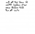
In the station, we have a variety of text- signs for depos, etc. Lets call the language 'Sumerian' - not the ancient cuneiform glyphs but a modern language for a utopian current civilization. With two exceptions we will not use English / Roman characters for this
Most of the text is not important to read; reading it will distract from the visuals, we mainly need it as a visual element, not a literal one. Thus we can make up fonts!
Style ideas:
However, choice of the general shapes of the letters is complicated by usage, I think we can identify 3 general types of lettering:
- signage and print : this should probably be a truetype font that is believable as type (or more than one for simple vs ornate)
- stencil-ish type signage: this should be similar to e.g. [1]
- graphiti: we should probably hand draw this in paint programs as needed (not a font file)
- handwritten: could be handdrawn but we could have a 'handwriting' style font. Comic sans Sumerian anybody ?
English/Roman
There are a couple of exceptions to this - We need to read gilgamesh's name in two places:
- Her Dogtags need to have her name in human readable form (maybe both!)
- The book title needs gilgamesh in human readable form.
Numbers
Numbers should be Arabic numerals i.e.: 1,2,3,4,5,6,7,8,9
Add your own language
It is encouraged to add words in the artists' own language as occasional elements ( a word here or there, graphitti, other...)


